Cricket Wireless
Switch & Get an iPhone Email Campaign
MY ROLE
• Designed and executed a promotional email using existing brand templates
• Refined visual hierarchy to emphasize the device incentive and switching offer
• Organized promotional messaging into modular sections to improve readability
• Delivered production-ready email design aligned with brand standards
APPROACH
The layout focused on clear value communication and scannable structure:
• Hero emphasis highlighting the iPhone promotion to capture attention immediately
• Structured modules separating plan benefits, offer details, and call-to-action
• Consistent typography hierarchy to guide readers through key information
• Mobile-aware spacing to ensure clarity across devices
This approach allowed the promotional message to remain clear and engaging without overwhelming the user with information.
OVERVIEW
Designed a promotional email supporting a customer acquisition initiative encouraging users to switch carriers in exchange for a discounted or free iPhone. Working within established templates and brand guidelines, the goal was to clearly communicate the offer while maintaining a clean, value-driven layout that prioritized readability across devices.
THE CHALLENGE
Promotional emails often contain multiple pieces of information—device details, eligibility requirements, and plan benefits. The challenge was to organize the content in a way that highlighted the iPhone incentive first while keeping the overall message easy to scan and visually balanced within a templated email structure.
OUTCOME
Delivered a production-ready email design that communicated the promotional offer clearly while maintaining brand consistency and supporting a high-volume marketing initiative.
Cricket Wireless
Social Media Campaigns
MY ROLE
Designed social media assets supporting multiple marketing campaigns
Applied brand typography, color systems, and promotional frameworks across placements
Adapted messaging and layouts to accommodate different campaign offers and priorities
Delivered platform-ready creative for digital distribution
APPROACH
Each campaign required balancing promotional messaging with brand consistency. Designs focused on:
Clear hierarchy to highlight the primary offer or announcement
Modular layouts that could adapt across formats
Consistent visual language aligned with brand standards
Attention-grabbing compositions optimized for fast-scrolling environments
This approach ensured that individual campaigns felt distinct while still reinforcing the broader Cricket brand identity.
OVERVIEW
Designed social media content supporting multiple promotional campaigns for Cricket Wireless, translating campaign messaging into visually engaging assets for digital platforms. Working within established brand guidelines, the work focused on maintaining visual consistency while adapting messaging across different promotional initiatives.
THE CHALLENGE
Social promotions often involve frequent campaign updates, shifting offers, and multiple messaging priorities. The challenge was to design social content that remained visually cohesive while clearly communicating promotional value across different campaigns and formats.
OUTCOME
Delivered a series of promotional social media assets supporting multiple campaigns, maintaining visual consistency and clear messaging across a range of marketing initiatives.


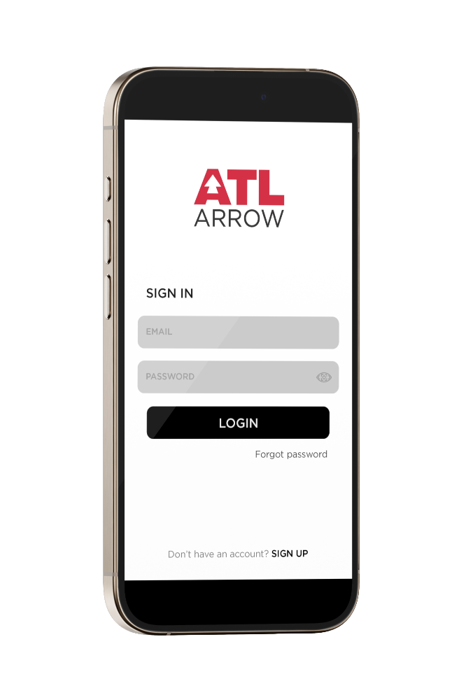
Hartsfield-Jackson Atlanta International Airport
Digital Signage Control Application
MY ROLE
Led visual design for the ARROW application interface
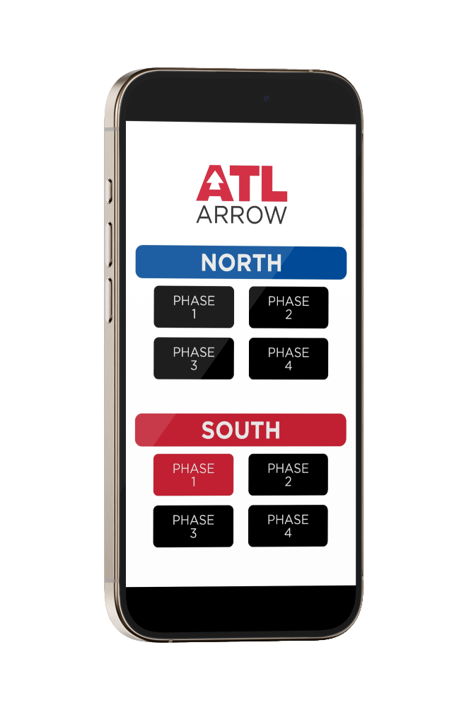
Defined navigation structure to support quick access to signage controls
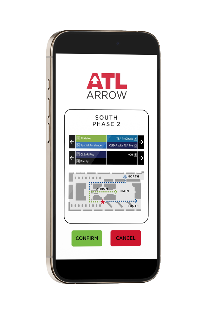
Designed screen layouts and interaction patterns in Figma
Built reusable UI components to ensure consistency and scalability
Applied established brand typography and color systems within the product interface
APPROACH
Operational clarity
The interface was structured to prioritize speed and clarity, enabling operators to quickly locate and update signage content during high-pressure situations.
Navigation architecture
A simplified navigation system was designed to organize signage groups and streamline access to frequently used actions.
Component-based design
Reusable UI components were developed to maintain visual consistency across the application while supporting future expansion.
Brand alignment
Existing brand typography and color standards were incorporated into the interface to ensure the application integrated seamlessly with the broader airport communication environment.
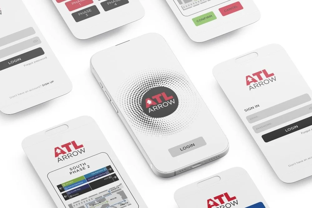
OVERVIEW
ARROW is an internal platform developed to manage digital signage across airport terminals during high-traffic and overflow conditions. The tool allows airport operations teams to update and control directional messaging in real time, helping maintain clear passenger flow during peak travel periods.
I led the visual and interface design for the application, translating existing brand standards into a functional UI system while defining navigation patterns that supported efficient operational use.
THE CHALLENGE
Airport operations teams needed a centralized interface to manage newly installed digital signage throughout the terminal. During periods of congestion or operational disruption, staff must be able to update messaging quickly and accurately to guide passenger movement.
The challenge was to design an interface that could support fast decision-making while maintaining visual consistency with the airport’s established brand environment.
OUTCOME
The resulting interface provided airport operations teams with a centralized system for managing digital signage across the terminal. By combining a clear navigation framework with modular UI components, the platform supports efficient content control while maintaining alignment with the airport’s established visual identity.